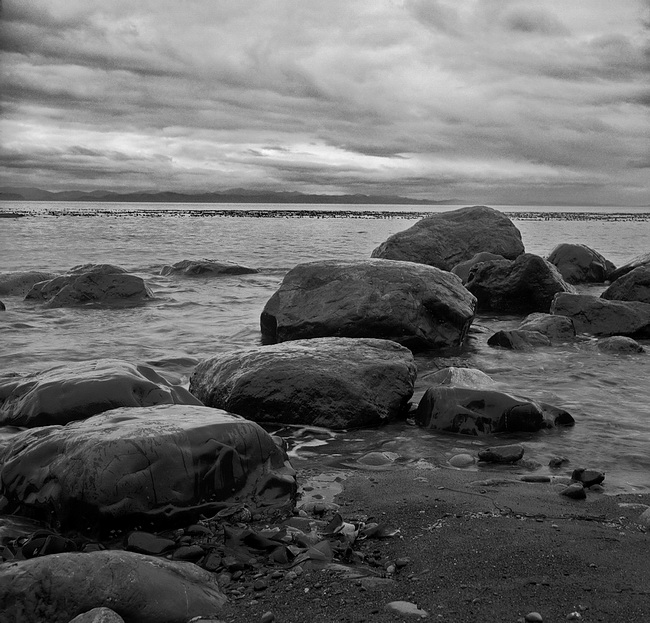
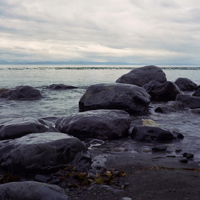
The photo above was shot with colour negative film, and then converted into a black-and-white image with software. To my eye at least, it reads far better this way than it does in colour. Indeed, if I had been carrying around my Hasselblad at the time, I would have shot this in b&w anyway. By comparision, the colour original is rather uninspiring.
I kind of knew it would be at the time I took the shot, but it was late in our trip to the park and I wanted to finish off the roll before leaving. This was photo #12. In reality, there are several things going on here that make the b&w image much better. First, the subject (a dull, grey day) works much better this way — there simply isn’t a lot of nice colour to work with. When I viewed the scene, I was attracted to the diagonal row of boulders receding into the sea and the textures of the clouds, neither of which are enhanced with colour.
But as important as the compositional elements are, much also depends on post-processing. I put a lot more effort into working up the converted image than I did the original. The colour version is essentially a straight scan with only a little tweaking, so, to that extent at least, the comparison is unfair. That said, even a lot of work on the original likely wouldn’t produce a compelling image.

 Subscribe with RSS