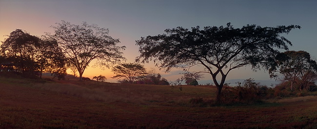
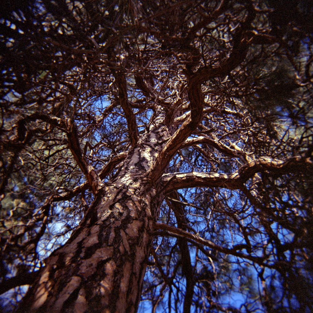
Same tree as previous image, and essentially the same composition. I think it works better in colour. In black-and-white there’s not enough tonal separation between the sky and the tree for the latter to stand out sufficiently. But I do like both.
Topics
-
Recent Posts
Recent Photos

 Subscribe with RSS
