(Camera: Yashica-Mat; Film: Kodak Ektar 100.)
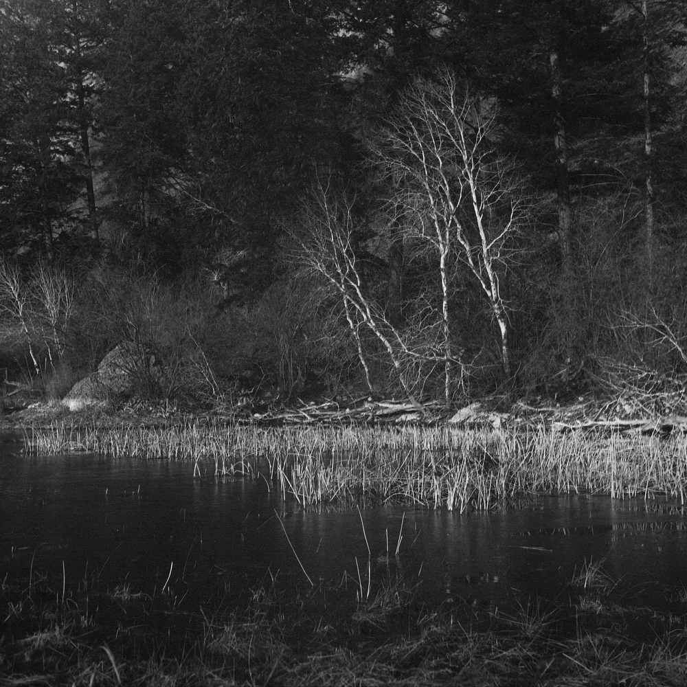
I’d been thinking about trying to make a black-and-white darkroom print using the colour negative that I used to make the scan below. When I look into doing this previously, an on-line search turned up a million reasons why it wouldn’t work very well. Then I saw this Ilford video and decided to give it a try. The result is the print shown above. (This is a quick-and-dirty flatbed scan of the print I made last night.) I opted for a dark and moody look, but I could have printed something less contrasty if that was my desire.
I didn’t find anything particularly challenging about printing the neg. I approached it the same way I always do, which means using variable contrast paper and split-grade printing. My exposures weren’t unusually long (16-seconds for filter #5, 5-seconds for filter #00) and I got what I wanted.
Working on a second neg, a few differences hinted at in my first go became reinforced. First, I found it a bit harder to get subtle tonal gradations (especially in the highlights) with a colour negative compared with a normal black-and-white one. Second, my test strips showed that the colour neg was quite a bit more sensitive to changes in exposure time. Normally I find strips with 1/3rd stop increments is about right, but with a colour negative I found 1/6th-stop changes gave noticeable tonal shifts. Neither of these factors were significant handicaps — they were just differences.
Being able to make black-and-white darkroom prints this way could prove a real boon to me since I have quite a few colour negatives that I’ve converted to black-and-white digitally and that I think look better that way. Now I won’t hesitate to at least try.
 Subscribe with RSS
")

")
")
")
")
")
")
")
")